Concept: Cutting a 7-Click Booking Path Down to One
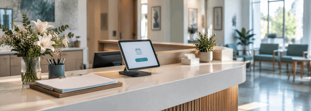
Starting Point
A well-regarded local clinic with five providers, but a website that listed services in a wall of text with no clear way to book.
The Problem
Patients researching providers online had no fast way to see credentials or book an appointment — the only contact option was a phone number, buried seven clicks deep.
Our Approach
The site was restructured around the two things patients actually decide on: provider credentials and how fast they can get seen. The booking/enquiry path was shortened to under 10 seconds from any page, and provider bios were rewritten to lead with specialty and experience.
What Changed
- Provider credentials surfaced clearly on every relevant page
- Booking path shortened from 7 clicks to 1
- Mobile-first layout throughout
- Privacy-conscious form copy and fields
The Outcome
Concept build — no results claimed. Industry data shows 1-second load times average close to 40% conversion versus 29% at 3 seconds, and a 100-millisecond delay alone can reduce conversions by up to 7% (Akamai) — a gap that matters directly for a booking-driven site like this.
Industry Context
64% of iOS users won't wait more than three seconds for a page to load (2026 mobile performance data) — for a clinic site where the goal is a fast booking decision, load speed is a clinical-trust signal, not just a technical one.